THE IMPACT OF COLOR ON PURCHASE DECISIONS
Did you know? Consumers typically spend less than 90 seconds evaluating a product, and up to 90% of this decision is influenced by color. Although we sometimes don't realize it - color plays a huge role in attracting attention, evoking emotions, and driving purchasing behavior.
In an era where images reign supreme, color selection is not only an aesthetic factor but also an important communication strategy in brand design, product photography, and marketing content creation.
So how specifically does color influence purchase decisions? Let's explore through the article below.
Color in design: Not just beauty, but also strategy
In brand design or product packaging, each color conveys a specific message. For example:
Red evokes urgency and stimulates shopping (often used in discount programs).
Blue brings a sense of trust and professionalism (common in the finance and technology industries).
Yellow and orange create a cheerful, outstanding feeling, often used for youthful, dynamic products.
Black represents luxury and power, often seen in high-end brands.
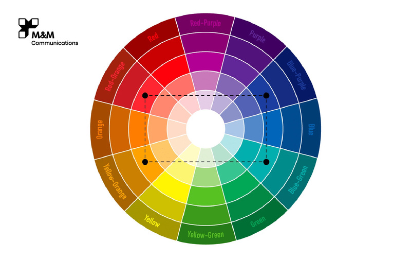
Choosing the right color for the target customer file and brand personality is a decisive factor in the success of a product in the eyes of consumers.
>>> Factors that make a brand's products different
Color in product photography concepts
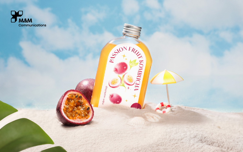
In the field of commercial photography, color is the factor that leads emotions and tells the story. From lighting, background, and props to main color tones, everything needs to be harmonious and purposeful. A good concept is one that:
Tells the brand story through color.
Highlights the product without being confusing.
Elicits positive emotions from viewers.
For example: A set of skincare product photos can use white-pastel blue tones to convey purity and gentleness. On the contrary, a concept for high-end mooncakes will choose brown - deep red tones to create a cozy, nostalgic, and luxurious feeling.
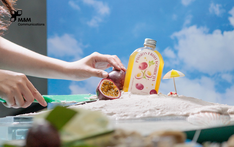
Color and image quality - A duo that strongly affects purchasing behavior
According to many marketing studies, images with clear, sharp colors, beautiful composition, and harmonious lighting will create a higher sense of trust in customers. On the contrary, images that are blurred, have the wrong color, or are too dark will reduce the professionalism and persuasiveness of the product.
In the online environment, customers cannot touch, smell, or try the product – they buy by feeling through the image. Therefore, a set of photos with the right color for customers' psychology and clearly showing the product's characteristics is the first "funnel" to attract them to your brand.

>>> Color matching principles and meanings in photography
M&M Communications – Accompanying you in building brand image
With practical experience in a series of communication campaigns and commercial photography, M&M Communications is proud to be an agency that accompanies businesses on the journey to build impressive product images. From concept creation, color coordination, and scene staging to image post-production – the M&M team always puts brand consistency and customers' visual behavior first. Whether you’re looking to create a high-end product photography series or a youthful, modern style – we’ll help you choose the right colors to say exactly what your brand needs.
Conclusion
Color is not just a secondary element in marketing—it’s part of your positioning and closing strategy. Knowing how to use color correctly in your design, photography concepts, and communications will help your brand stand out from the crowd and leave a lasting impression on your customers.
Let your images and colors speak—M&M Communications will do it professionally.